Redesigning the Onboarding Experience
We created a new post-installation experience to onboard first-time customers onto the Brilliant Smart Home ecosystem.
platform
Mobile App (iOS/Android)
Role
Sole Product Designer
Company
Brilliant Smart Home
Problem Space
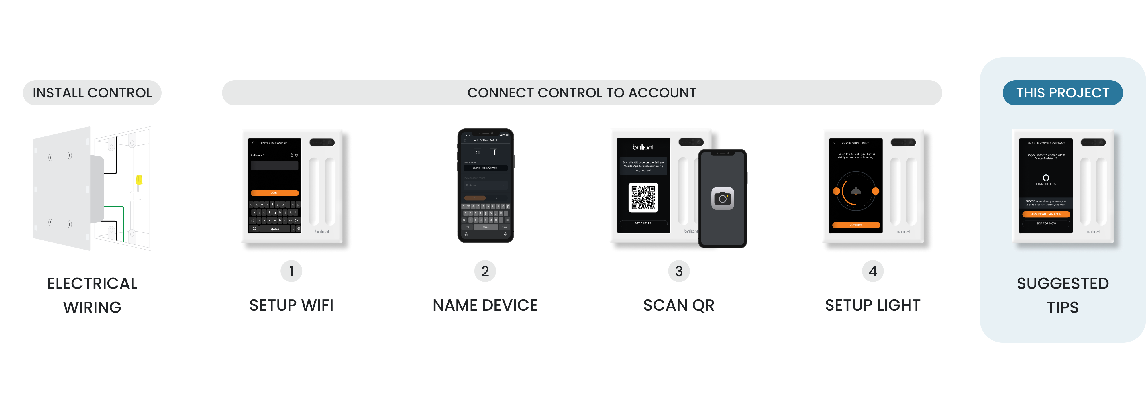
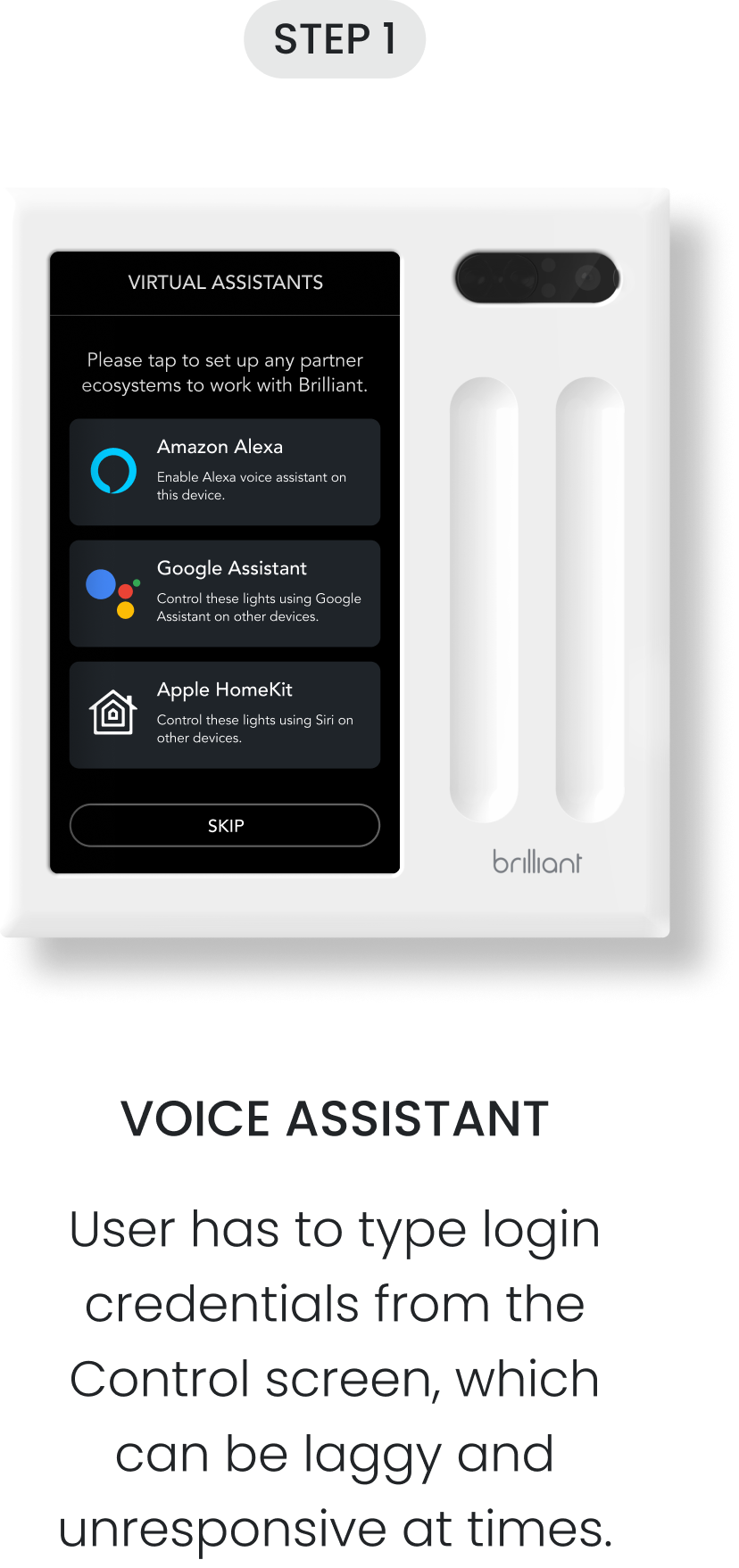
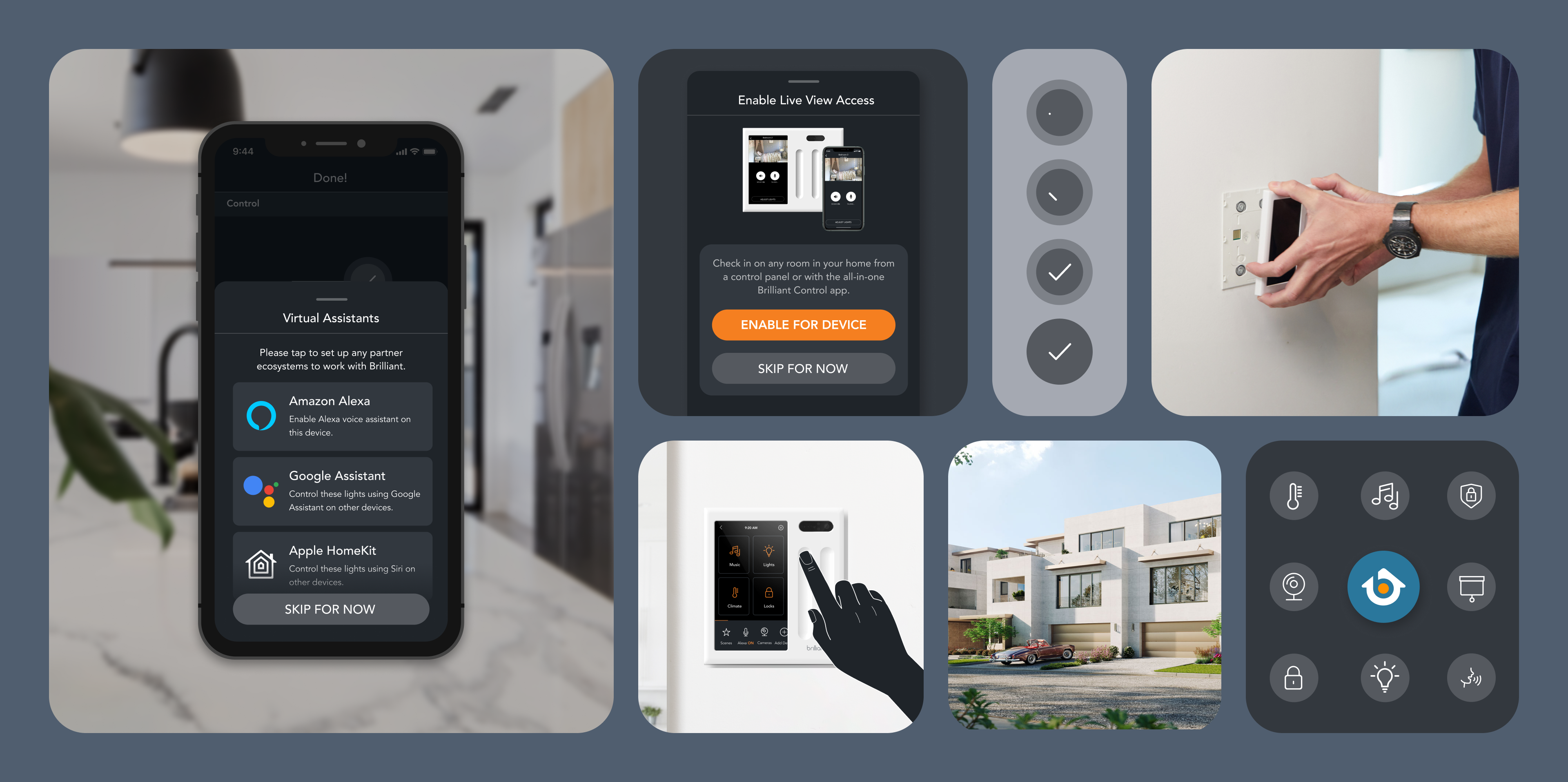
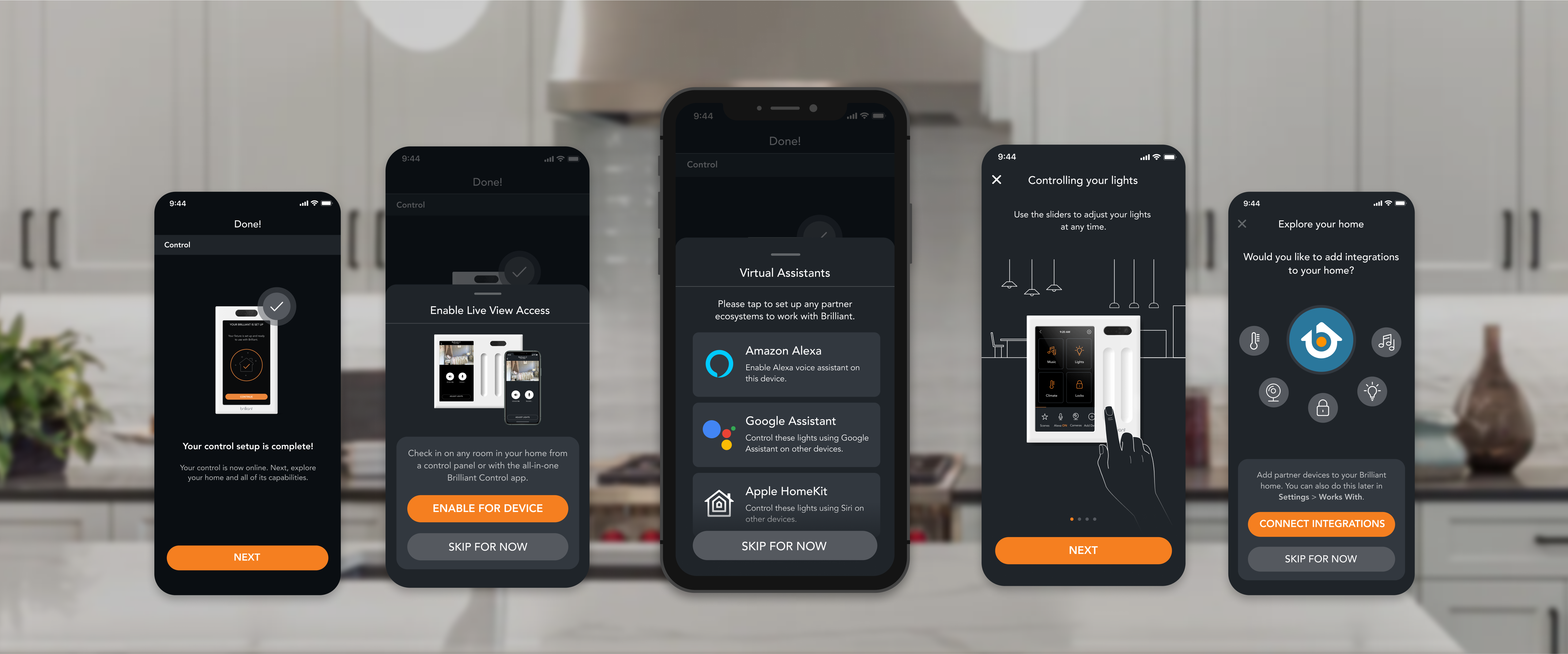
Setting a Control panel isn't quite easy—it involves electrical wiring and completing various steps on the Control/mobile app to connect the new device to your account. Afterwards, the user is asked as part of the onboarding process if they’d like to set up some useful features to help them get the most value out of their smart home.
The Brilliant Control panel is often installed at an awkward height, forcing users to crouch down for extended periods of time to set up their smart home. Setting these features up can take some time on the Control and extend the installation process, frustrating users.
At this time, the onboarding experience was exclusive to the Control panel (as seen below) and the mobile experience had not been built yet.
The Feature
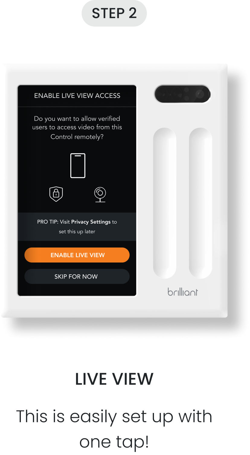
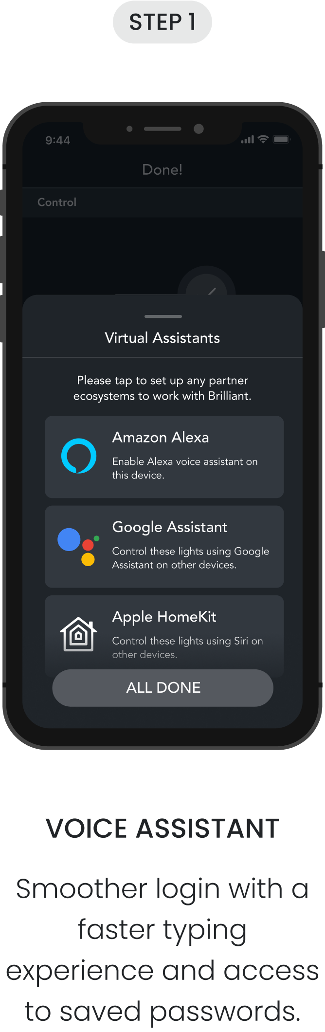
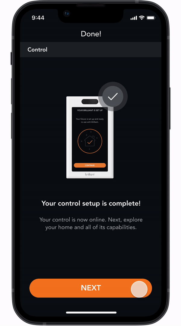
Since these tips are now surfaced on the mobile app, users can take their time learning about and setting up these features from the comfort of their couch. Users have a smoother login experience for adding voice assistants and partner devices because of reduced steps, the smartphone's smoother keyboard experience, and easy access to saved passwords.
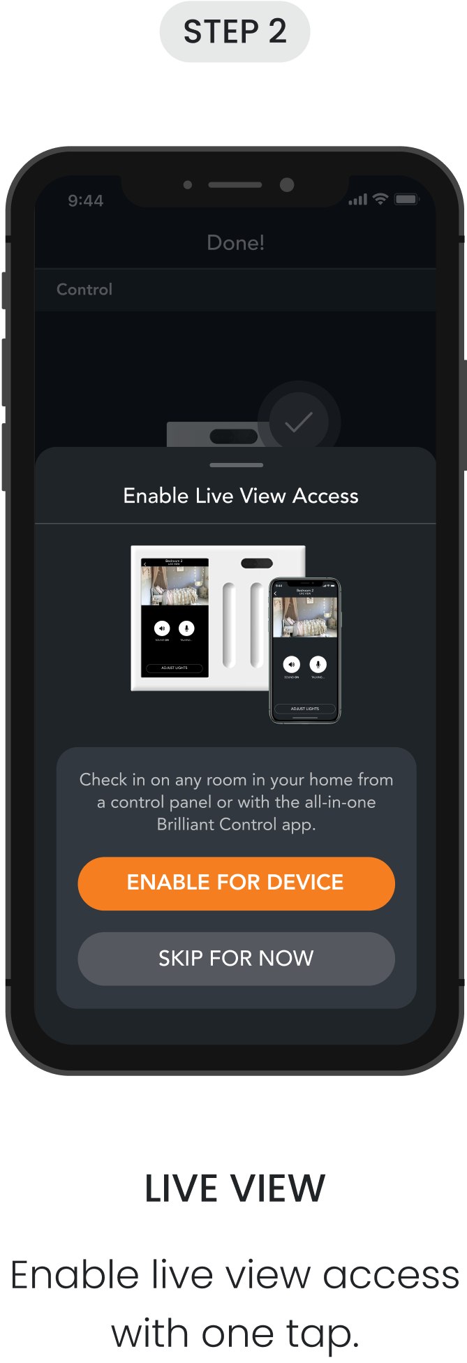
I created and added new set of drawers and full-screen popups to the design library. These were used to quickly surface/dismiss information relevant to the step that the user was currently on.
I also added new illustrations and success animations to help users better understand each suggested feature and communicate what was happening better in a more visually engaging way.
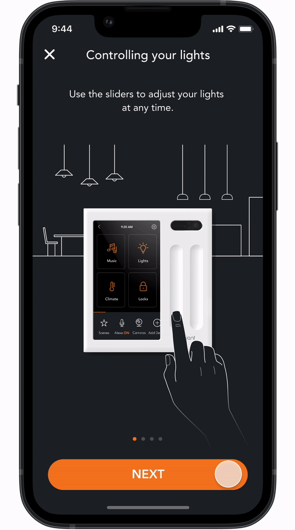
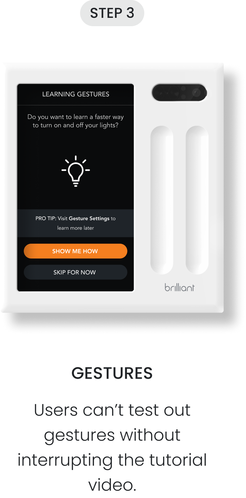
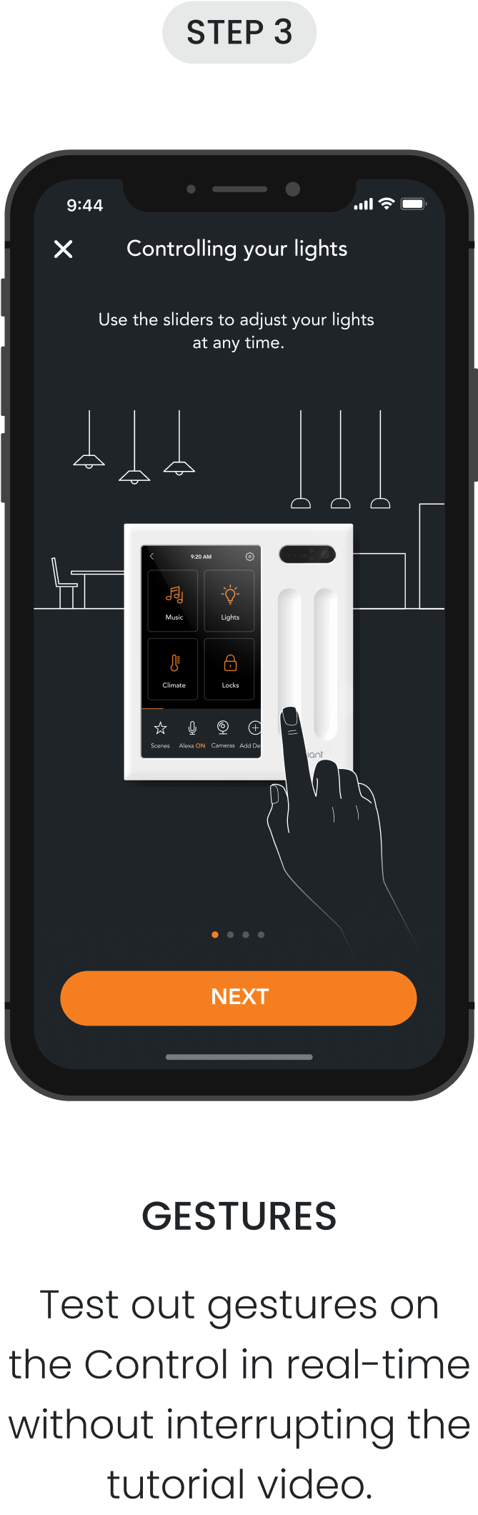
Historically, the mobile app and Control has a limited usage of animations. Since these animations can take some time—for both the designer and the engineer—I understood why it was often deprioritized.
I took this project as an opportunity to add new animations that could better demonstrate how different gestures can adjust the smart lights in various ways (ex: turning on ONE light vs. ALL of the lights in the room) and give this feature an updated look as an added bonus. The original tutorial on the Control was a video of someone performing the different gestures, but only explained how the lights are controlled differently in writing.
impact
19K+
Control panels and smart dimmer switches have been set up with this experience.
37%
improvement in customer ratings for the installation experience post-release.
22%
increase in gesture usage since adding the gesture tutorial to the mobile app.
Takeaways
I used to run a design idea by the PM verbally, then spend time learning how to make the animation come to life with another designer. After getting the hang of smart animation on Figma, I began running animation ideas with quick high-fidelity prototypes. It was much easier to explain ideas visually.
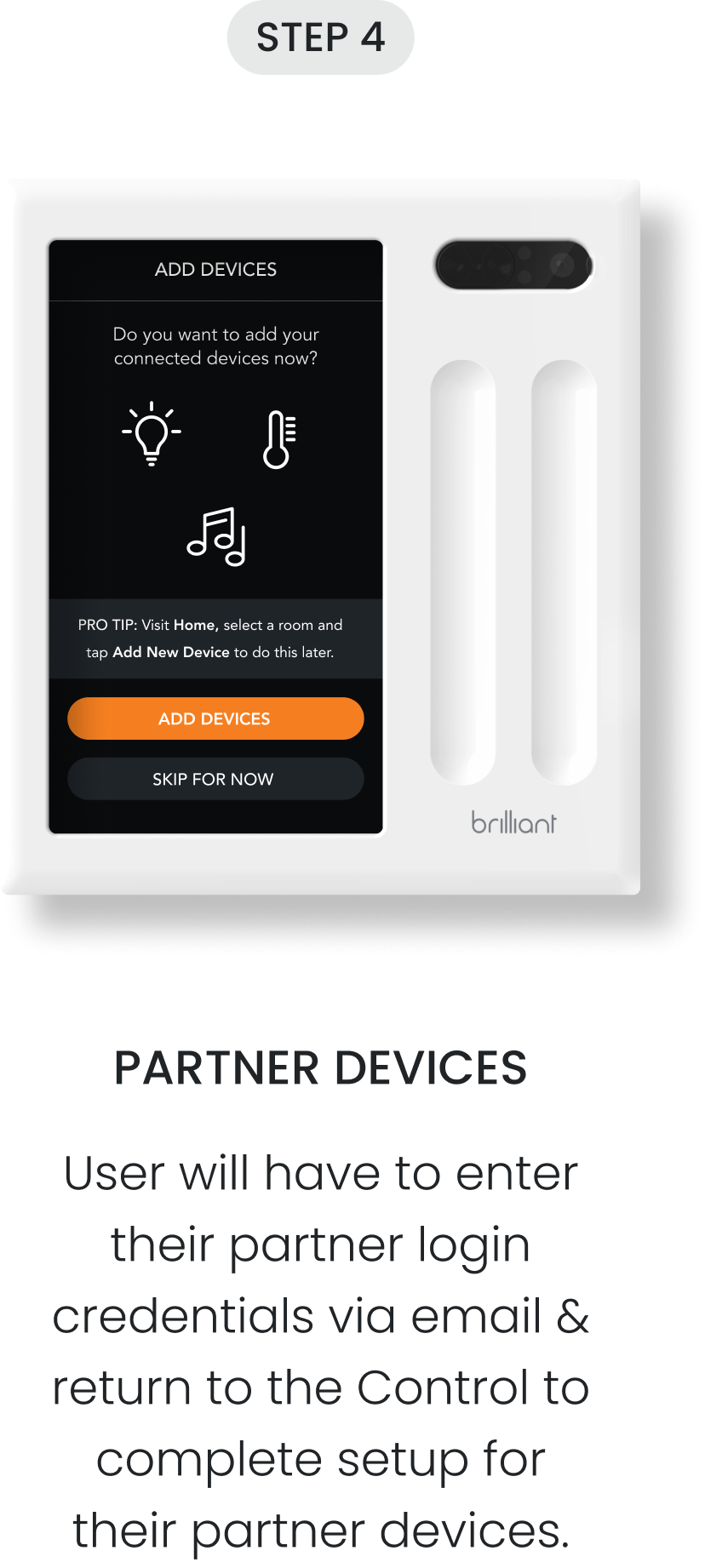
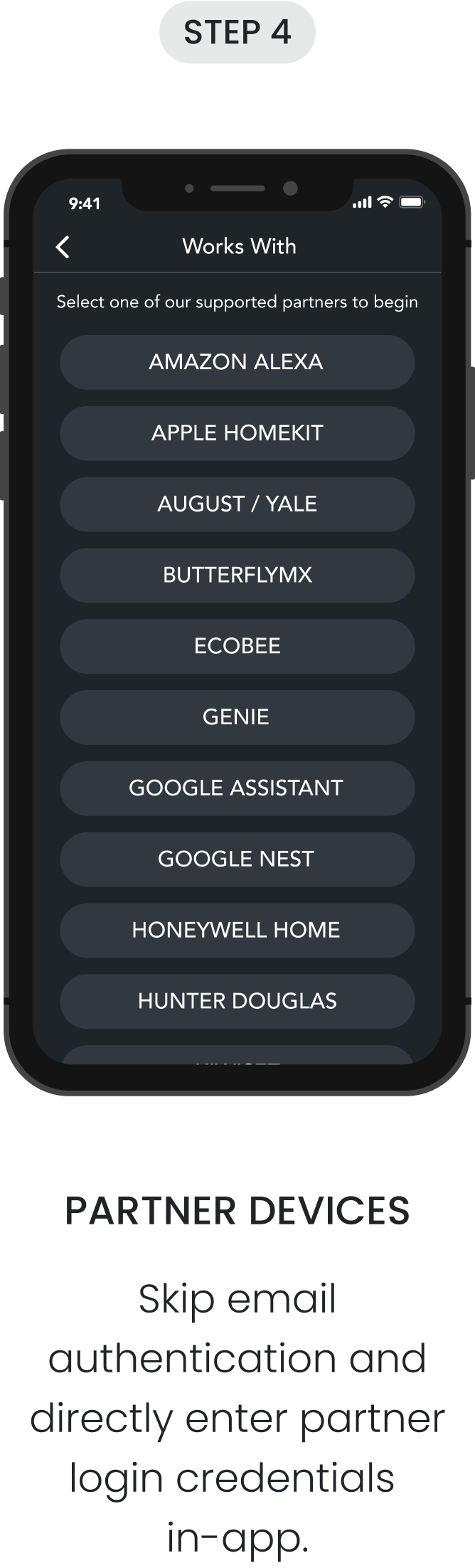
Creating the mobile experience for linking partner integration accounts was not easy. During the linking process, many things can go wrong—what if the internet connection is unstable or the API request fails? Working with engineering to learn about what goes on in the backend helped me identify edge cases I needed to account for, and allowed me to re-adjust my designs appropriately.